Fairway
Fairway helps people book and ride the Washington State Ferry and explore the Pacific Northwest! Fairway provides users with the right information at the right time so they can relax and enjoy the ride.
Time Frame: April -August 2021
Team: Nathaniel Gray, Maisie Howard, Fontayne Wong
My Role: Product Designer from start to end! I conducted research and wireframing, then created and tested the final design. I had a special focus on the Desktop Wizard design.
Skills: User Research, Journey Mapping, Service Design, UI/UX Design, Experience Design, Field Observation
Ferries are Awesome!
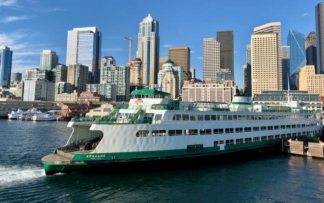
Riding the ferry is a regional favorite for many Seattleites. For some, it’s a convenient commute for others, it’s an attraction on its own and a gateway to new adventures over the water.
…but sitting in ferry traffic stinks.
The online system is difficult to navigate and floods users with irrelevant information.
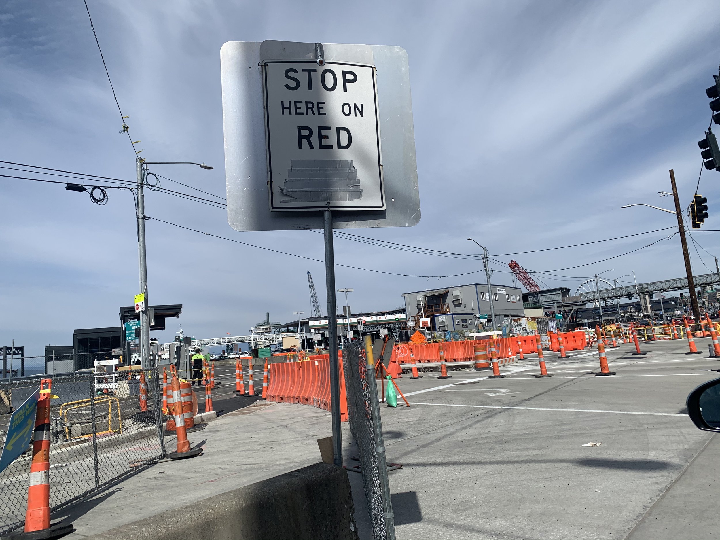
The ferry terminal itself is confusing as cars must line up (sometimes for hours!) before reaching a point where they offer any information on fare, space availability or sailing times.
Ride with Fairway for a better time
Fairway reduces confusion and keeps you informed with route-specific information as conditions change.
Phase 1. Discovery
Mind Meld!
We started by gathering (safely!) outdoors to find a suitable problem space. After a few rounds of exploring, affinitizing and narrowing down, we ended up choosing a regional-specific issue - booking a trip on the Seattle Ferry system.
What’s the standard?
We started our desk research by exploring the Washington State Department of Transportation (WSDOT) Website. We all had experience riding different ferry lines and had a general concept that they differed in terms of price, frequency of sailings, whether they allow cars, and if you need to reserve in advance.
Issues of note
Poor information architecture / heirarchy
Attention centered on ads
Unclear use of bolding and subscripts
Field Observation
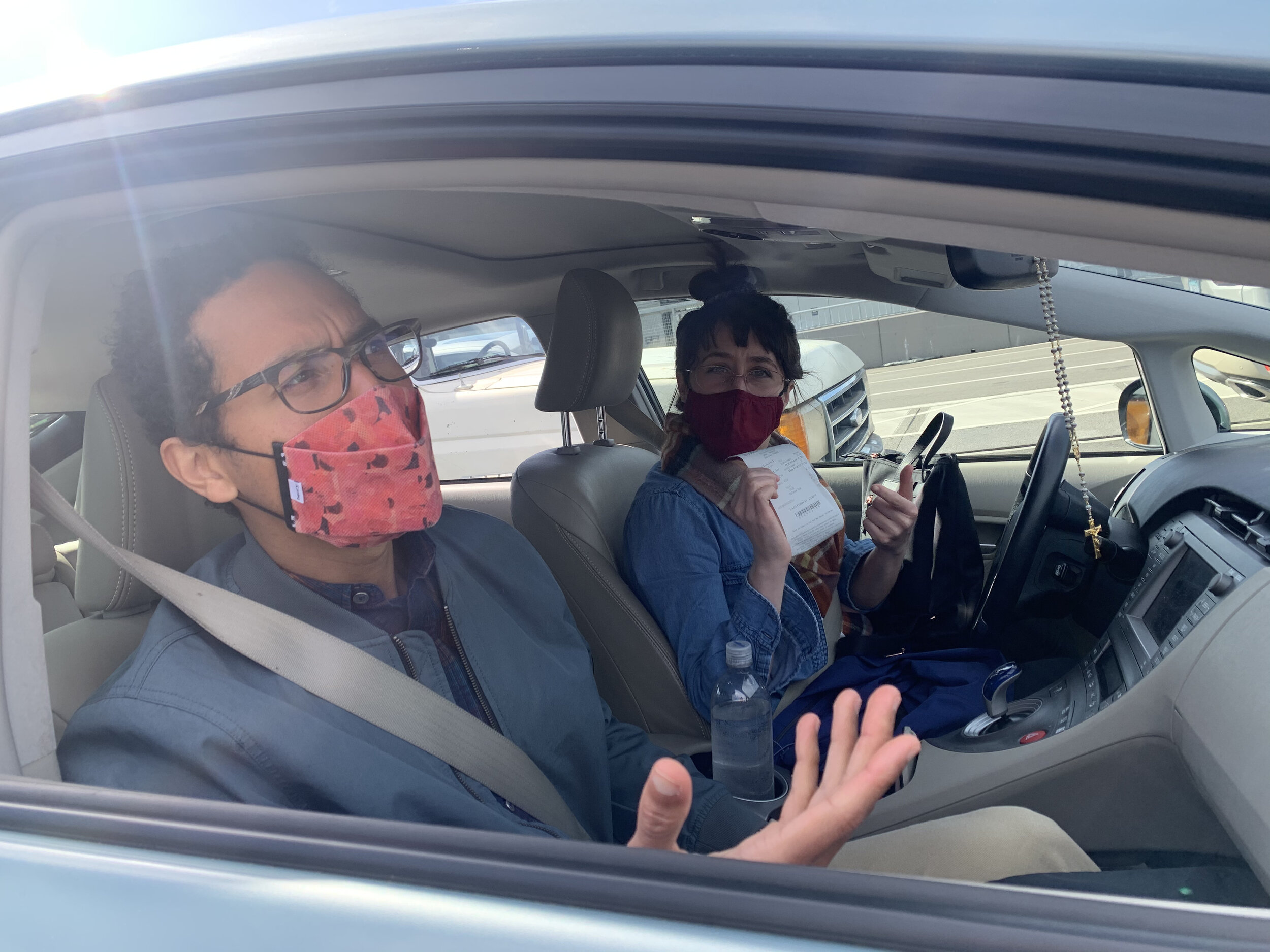
We had a tight turnaround on this project, so immediately after our decision on this problem space on Monday, we planned to make an in-person Field Observation on Wednesday.
We identified through the secondary desk research, and our findings in the field, that there were three big points of confusion in this process.
Route-specific info is hard to find
The ferry terminal signage is confusing.
Lack of on- the go, real-time updates.


To get a better idea of who we would be designing for, we created two Personas based on the values and desires of the people we met on the ferry.
We then made a Journey Map to find barriers and facilitators.
Phase 2 : Ideation
Idea Generation
We each went aside and sketched out a number of potential service solutions for the issues that we identified. We then gathered and downselected based on our values criteria
Values Based Downselection
We identified what was important to our users and downselected based on that criteria.
We decided on a hybrid product that the user could take with them on their journey rather than a full systemic overhaul or physical changes to the ferry.
What’s a comprable service?
We created a Lean Canvas to keep us on track with our strategy, who we’re serving, how it would potentially survive in the real world (we’re talking $$$ here), and why our target audience would use this product.
We checked in with our stakeholders (the prof and the class lol) and got positive responses. The professor even considered our presentation “masterful” which was encouraging.
Phase 3 : Design
We then mocked up some basic wireframes for both the mobile app, and the desktop wizard.
Information Architecture
We started to get mixed up with what should come before and what after, so we took a step back and created an Information Architecture diagram to get it straight.
This led to our higher fidelity mobile and desktop designs.
This led to our higher fidelity desktop design.
At this point we were able to conduct UI tests and gather observations.
The initial designs had an unclear difference between tickets and reservations. We decided to integrate the tickets and reservations into a central system.
Further, it wasn’t clear why someone would buy a ticket in advance if it didn’t reserve a spot. We consolidated into a fast pass system that would allow riders to reserve a spot and wait in a specialized fast pass line.
Our tests revealed that people didn’t understand what a percentage of capacity meant for them in a logistical sense. All they wanted to know was if they would get on this ferry or if they would need to get the next one.
Notifications were given in a static way separate from the ferry trip itself. We decided alerts should be associated with the exact ferry that the rider is taking. The second format shows the ferry and it’s associated alerts along with the highlighted route .
We found that there was confusion between the SMS option and the mobile app. People asked why you might download. We wanted to offer SMS for infrequent users who may not want a whole app for a one-off weekend trip. We clarified that there are additional features within the app, for example, you can follow along as the ferry physically travels across the sound.
Further, we created a custom in-person Service Experience, where we replicated a full ferry trip.


Takeaways
Team: This was a quick-moving project, it was a huge advantage to work closely with friends.
Specificity: Nailing a specific regional problem can yield more interesting results than an undefined problem.
State vs Private institutions: state institutions are slow to innovate, there’s lots of room for improvement.
Time Constraints: Had we the time and clearance I would have liked to talk with the ferry workers and other stakeholders. More time for more research and design would benefit the product as well, but I think we did really well for ourselves.


